


Dashboard metrics refresh in seconds, yet leaders still ask for PowerPoint. That disconnect forces you to copy-paste Excel charts, chase broken links, and rebuild axes. A 2025 global survey by empower® found that employees lose an average of two and a half hours each week just re-formatting slides. The culprit is the last-mile gap between raw data and a clear PowerPoint data-visualization story.
In this guide, we compare five tools, each designed to plug a different leak: AI drafting, advanced business charts, live refresh, KPI variance, or on-brand templates. Choose the fix that matches your workflow and win back your evening.
Quick answer: the five best tools at a glance
Want the short list? The table below matches each product to the single workflow gap it fills, notes whether the output stays editable in PowerPoint, and shows the lowest public price as of July 29, 2026. Check the security column before you subscribe, then jump to the deep dive that follows.
| Tool | Bottleneck it fixes | Output type | Live-data support* | AI features | Starting price† | Security note | One-line verdict |
| Plus AI | Blank-slide, first-draft creation | Native editable PPT charts | Limited (Excel link / API) | Built-in slide + chart generation | $10 per user/month | SOC 2 Type II | Fastest jump from prompt to polished slide |
| think-cell | Complex business charts | Native editable PPT charts | Strong Excel link refresh | “Assist” chart suggestions | $28.60 per user/month | Vendor docs only | Consultant-grade waterfalls in seconds |
| DataPoint | Slides that go stale overnight | Linked or live objects | Best-in-class multi-source feeds | Minimal | $39 per user/month | No public cert | Turns any deck into a living dashboard |
| Zebra BI | KPI and variance reporting | Editable Office visuals | Excel-driven refresh | Emerging | €58 for up to 10 users/month | No public cert | Makes management reports read themselves |
| SlideModel | On-brand design in a hurry | Editable PPT templates | None | Separate web-based AI maker | Free tier + paid subs | Low cloud exposure | Huge library when IT blocks add-ins |
†Prices verified July 29, 2026; confirm current rates. Plus AI price reference: Vendor price page
How we evaluated PowerPoint data-viz tools
To keep this guide factual, not a generic “best-of” list, we scored every product against the pain points users complain about most: broken Excel links, charts that refuse to refresh, AI errors, and month-end slide surgery. A global survey by empower® reports that employees lose 2.6 hours per week to formatting fixes.
Our eight-factor rubric
| Criterion | Weight | Why it matters |
| Visual clarity | 20 percent | A boardroom slide must read at a glance. |
| Ease of use | 15 percent | Speed beats features when deadlines are tight. |
| Chart breadth | 15 percent | Waterfalls, Mekko, and variance charts are must-haves for execs. |
| Automation / live refresh | 15 percent | Links, schedules, or AI features that cut manual work. |
| Design flexibility | 10 percent | Brand colors and annotations should survive a data update. |
| Collaboration | 8 percent | Colleagues without the add-in still need to edit the file. |
| Pricing value | 7 percent | A low-cost tool that misleads leadership is no bargain. |
| Security & compliance | 10 percent | Confidential decks need documented controls. |
We drew a firm line at editability: the output must stay a native chart, shape, or live object, never a flattened PNG.
Every vendor claim was cross-checked against public documentation. Microsoft, for example, still recommends linking Excel for data that updates often, which confirmed our focus on refresh reliability.
Only tools with enough public evidence passed the screen. Raw scores live in a companion sheet so you can audit the math; this article stays focused on the practical payoff, helping you choose the fix for your specific workflow gap.
Why leaders still ask for decks, not dashboards
Dashboards shine during exploration: you can slice, filter, and pivot live data. Yet when a decision is on the line, executives still reach for a PowerPoint file. A 2025 survey by Exasol found that 71 percent of business leaders rate data-storytelling skills as “very important” when sharing results with the C-suite.
Why slides win the meeting
- Focus. A deck strips away dozens of optional metrics and spotlights the one insight that matters today, freezing the numbers so everyone debates the same snapshot.
- Ubiquity. PowerPoint opens on any laptop, with no firewall, license, or training required. Directors can annotate pages, forward them to legal, and place them in a board pack.
- Narrative. Slides guide the room from context to recommendation in a clear story. Dashboards tempt busy leaders to chase pet metrics and miss the conclusion.
Those practical advantages explain why our scoring model rewards tools that turn raw analysis into editable slides. Until meeting culture shifts, the deck remains the language of the corner office, so the software must respect the medium while solving its long-standing pain points.
Plus AI: best for AI-assisted chart slides and first drafts
Try this newer style of AI presentation software that lives in the apps you already use.
Overview
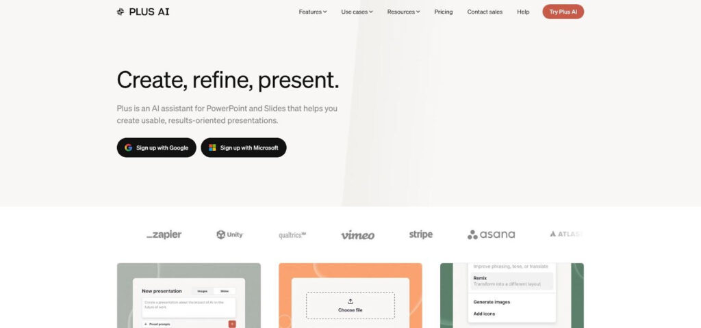
Plus AI lives inside PowerPoint and Google Slides. Paste a verified table (or a detailed prompt), click Generate, and the add-in produces an on-brand outline plus editable chart objects you can tweak like any native slide element. Because the output stays fully editable, you can change categories, fonts, or theme colors without breaking the layout.
Why it helps
- Drafts faster than copy-paste. Vendor tests show a 10- to 15-slide deck appears in under two minutes on a typical business laptop.
- Keeps data accurate. Charts pull directly from the table you supply, not hidden sample numbers.
- Works where you already work. One add-in covers both PowerPoint and Google Slides, so teams avoid juggling tools.
Pricing and security
Basic plans start at $10 per user per month when billed annually. Every tier includes a seven-day trial and SOC 2 Type II controls with encryption at rest and in transit.
Try this newer style of AI presentation software that lives in the apps you already use.
think-cell: best for advanced business charts
Overview
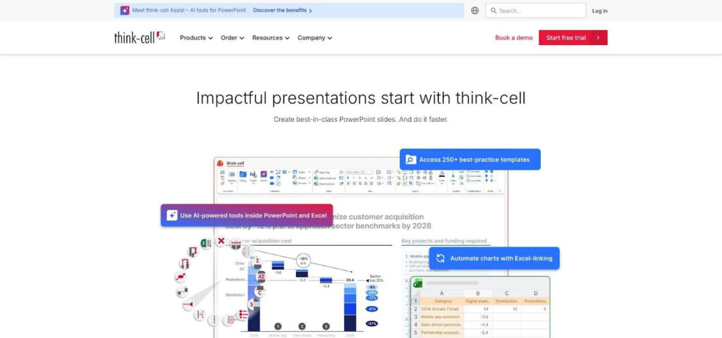
Native PowerPoint struggles with waterfalls, Mekko, or driver bridges. think-cell fixes that by adding more than 40 business-grade chart types inside PowerPoint and Excel, each with automatic totals, growth arrows, and smart label placement. Work in Excel, select a clean range, choose Insert chart, and a fully formatted slide appears. Change a cell, refresh, and the layout holds without copy-paste fixes.
Where it shines
- Waterfall bridges, contribution trees, Mekko maps, and Gantt timelines drop from hours to minutes.
- The new think-cell Assist side pane layers generative AI on top, suggesting the right chart or flagging outliers before you save.
Pricing and security
Single-user Suite licenses start at $28.60 per user per month billed annually, with volume discounts for larger teams. think-cell publishes deployment and data-handling notes online; regulated industries should request the full security brief, especially if they plan to enable Assist’s AI features.
Tips from the field
- Keep Excel ranges tidy; blank rows and merged cells trip any automation.
- Define a house style for colors and fonts once, then let think-cell inherit those defaults.
- Resist packing several exotic visuals onto one slide; clarity wins board approval.
DataPoint: best for live and automatically refreshed slides
Overview
DataPoint links PowerPoint objects to 26 data sources—SQL, Excel, Azure, RSS, and more—so slides update on open, on a timer, or in a continuous kiosk loop. Change a table, reopen the deck, and every linked chart, text box, or picture flips to the latest values. Because DataPoint writes into native placeholders, colleagues without the add-in can still read or edit the file; they just lose the live connection.
Strengths you feel on day one
- Operations teams stream leaderboards in real time.
- Finance schedules a Monday-morning refresh instead of chasing screenshots.
- Marketing can run a rolling campaign dashboard on a lobby screen with no more PDF exports.
Costs and caveats
The Standard edition is USD $39 per user per month (discounted on annual plans). DataPoint works only on Windows and requires install rights, so check IT policy first. PresentationPoint lists basic encryption and access controls online, but no SOC 2 or ISO badge is public—regulated teams should request the full security brief.
Pro tips for a smooth rollout
- Pilot with one KPI slide before wiring the whole QBR.
- Add a Last refreshed timestamp to build executive trust.
- Use read-only service accounts and test failure cases such as moved files or VPN drops before going live.
A solid failure plan beats a perfect demo every time.
Zebra BI: best for KPI and variance reporting
Overview
Standard charts show what happened; variance charts show why. Zebra BI adds a finance analyst’s toolkit to PowerPoint and Excel, converting dense tables into compact visuals that highlight gaps between actuals, targets, and prior periods. All visuals follow the International Business Communication Standards (IBCS), now ISO 24896. Drop the add-in on a slide, link an Excel range, and Zebra stacks small-multiple waterfalls, bridges, or variance columns in seconds.
Where it excels
Month-end close packs, board KPI decks, and revenue bridges with many categories or currencies. Apply your brand theme once, and every card, sparkline, and delta arrow inherits the right colors and fonts, then refreshes when the workbook updates.
Investment and compliance notes
The Starter plan begins at €58 per month and covers up to ten Office users on both Excel and PowerPoint. Plans are billed annually. Zebra BI publishes security guidelines online but no SOC 2 or ISO 27001 badge; regulated teams should request the latest audit letter.
Field-tested tips
- Keep “Actual,” “Plan,” and “Prior” columns side by side with clear headers—Zebra’s logic depends on them.
- Break large dashboards into themed slides; too many KPIs dilute the message.
- Always sanity-check negatives; an upside-down profit bar erodes trust.
SlideModel: best for ready-made, editable templates
Overview
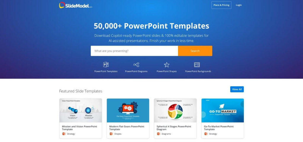
Need a board-ready deck today? SlideModel offers more than 50 000 editable templates—dashboards, funnels, maps, org charts, and more—each delivered as a standard .pptx file for PowerPoint, Google Slides, or Keynote. Swap the placeholder numbers, apply your brand theme, and ship.
Because SlideModel is a download library, no add-in install is required, which helps when corporate IT blocks third-party code. Colleagues without a license can still edit the file; they just can’t browse the catalog.
Where it helps most
- Board decks when the story is clear but design time is scarce
- Consulting sprints that demand varied visual styles
- Teams locked out of add-ins who still need editable charts instead of screenshots
Price and practicalities
Individual plans start at USD $99.90 per year for 200 downloads per month, while Professional and Team tiers unlock unlimited downloads. A small free catalog is also available. Finished decks live locally, which limits cloud exposure, but AI-generated slides come from a separate web tool with its own data rules.
Make the most of it
- Search by keyword, then filter for Data-Driven layouts to avoid static infographics.
- Apply your theme fonts and colors before replacing sample data to save reformatting time.
- Stress-test the chart with long labels, negatives, and extra categories; if it breaks, choose a sturdier layout before leaders see the slide.
Which tool fits your workflow
Pinpoint where your process stalls, then choose the fix:
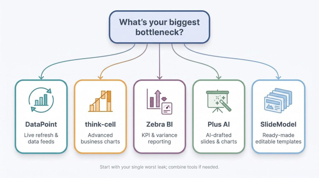
- Do numbers need to refresh after you share the deck? DataPoint links slides to 26 data feeds and updates on open or on a timer, so no more 6 a.m. PDF emails.
- Is the story built on specialist charts (waterfalls, Marimekkos, Gantt)? think-cell adds more than 40 business chart types and keeps them editable for last-minute CFO tweaks.
- Are executives asking, “How far off target are we?” Zebra BI standardizes KPI and variance visuals with IBCS-aligned charts.
- Facing blank slide syndrome? Plus AI drafts the narrative, applies your template, and inserts editable charts from your data.
- IT blocks add-ins, or you just need design fast? SlideModel lets you download an on-brand, data-driven template, swap numbers, and ship.
Start with your biggest bottleneck, then combine tools if needed (for example, Plus AI with think-cell, or think-cell with DataPoint). One targeted fix beats scattered, midnight rework.
Conclusion
PowerPoint remains the format executives trust when final decisions are at stake, so the right add-ins or template libraries can mean the difference between late-night slide surgery and a deck that simply works. Pick the tool that patches your single worst leak—whether that is blank-slide dread, broken Excel links, or hard-to-read KPI deltas—and reclaim hours every week for deeper analysis and sharper storytelling.
