


Late on a Thursday night. You run through a staging environment before a major investor pitch. Visual inconsistencies quickly become impossible to ignore. A thin, elegant user profile graphic sits next to a chunky, solid black settings gear. Navigation bars feature three different stroke weights. Random PNGs pulled from Google image searches clutter your dashboard.
Your front-end engineers spent Tuesday wrestling with CSS alignments. Designers spent Wednesday drawing missing interface elements from scratch.

At what point does pulling from multiple free sources cost too much? Developer time and brand perception take a hit when teams avoid buying a single library subscription. Saving forty dollars a month on assets ends up costing thousands in wasted payroll.
Scaling toward a Series A brings a harsh reality check. Building your second major feature module usually breaks a patched-together UI. Relying on scattered open source repositories eventually creates massive technical debt.
Fixing that mess requires a unified system.
Icons8 serves as a total replacement for that patchwork approach. It offers over 1,476,100 assets organized into strict visual guidelines. Product teams stop guessing and start shipping.
Consolidating Visual Styles Across Platforms
Finding highly specific concepts that match your core UI presents a massive challenge. Redesigning a data-dense dashboard means hunting for niche actions. Standard home or user shapes exist in any free pack. Obscure industry symbols don’t.
Try looking for a server-rack maintenance graphic in a minimalist style. Free packs leave you completely stranded.
Product teams can stop digging through disparate GitHub repositories. Standardize around a single massive category in Icons8 instead. Categories like iOS 17 contain over 30,000 graphics. Hitting a dead end rarely happens.
Picture a new document management interface. Open Pichon or fire up your web browser. Search for a notes icon. Filter your results strictly by Material Outlined. Locating the right shape only starts the process.
Click the asset to open the in-browser editor. You completely bypass Adobe Illustrator. Add a rectangular background with rounded corners. Apply your exact brand primary HEX code. Adjust internal padding so the vector breathes correctly.
Finally, layer a subicon. Drop a small checkmark in the bottom right corner. Download the finished SVG directly into your project directory.
Weighing The Market Alternatives
Auditing UI components generally leaves you with three options. Grab open source packs, pay for aggregator platforms, or build an in-house design system. Each carries distinct operational costs.
Free open source libraries like Feather or Heroicons work beautifully for early MVPs. They cost nothing and look fantastic. Scope remains their biggest limiting factor. Most free packs tap out at a few hundred symbols. Complex enterprise features outgrow them immediately. Developers suddenly find themselves mixing multiple libraries together. That instantly destroys visual harmony.
Aggregator services like Noun Project solve volume issues entirely. Finding a vector for absolutely any concept imaginable takes seconds. Structural consistency takes the hit. Independent authors upload assets to these aggregators with completely different corner radii, grid sizes, and bounding boxes. Developers spend hours manually aligning files in CSS. Scaling a product requires predictable grid structures.
Commissioning an in-house design team yields perfect consistency. Paying senior product designers to draw magnifying glasses is a massive misallocation of capital. Startups trying to ship a roadmap need their talent focused elsewhere.
Icons8 bridges that gap. You get aggregator-level volume categorized into 45 different strict visual styles managed by in-house design rules.
Engineering Workflows And Asset Management
Managing assets across a distributed engineering team requires extreme organization. Passing loose SVG files around via Slack guarantees version control disasters. Developers overwrite files. Designers lose source vectors. Nobody knows which graphic belongs to the current sprint.
Collections solve this directly. Create a new folder titled “Core App V2.” Drag every approved navigation and dashboard asset inside. Share that exact folder with your entire product organization. Apply a bulk recolor command before handing files off to front-end engineers. Every single graphic in that collection instantly adopts your exact brand palette. One click fixes everything.
Delivery methods dictate the actual implementation. Export the entire collection as a single SVG sprite rather than downloading forty individual files. Teams might prefer a customized web font instead. Both options keep your codebase remarkably clean. Marketing teams needing the same assets for a public website can grab Base64 HTML fragments. Direct CDN embed links completely eliminate file hosting complexities. Engineers spend zero time managing static asset folders.
Friction Points And Dealbreakers
Icons8 works wonderfully for standardizing product design. But certain workflows reveal distinct limitations.
Unpaid tiers fail completely in production web applications. Downloads are hard-capped at 100px PNG files. These look blurry on modern high-density displays. Zero-cost plans also mandate attribution links. Those look incredibly amateurish inside a SaaS dashboard. Accessing lossless, scalable SVGs requires a paid subscription. You can grab free SVGs in Popular, Logos, and Characters categories. Commercial use of logos requires trademark owner approval anyway. Enterprise teams shouldn’t bother with unpaid accounts.
Technical execution of vector paths causes friction for advanced front-end teams. Downloads default to simplified paths. Optimization reduces file size for static display perfectly. Custom CSS animations targeting specific strokes will break. Developers must explicitly uncheck the simplified setting during download. Retaining editable paths requires that manual step. Missing that toggle wastes debugging time.
Animated formats introduce their own rigid boundaries. Thousands of animated graphics come as GIF, After Effects projects, and Lottie JSON files. Onboarding screens benefit greatly from these formats. They remain isolated from the rest of the toolkit. Opening animated files in Lunacy to edit vector paths isn’t possible. Combining them with text graphics inside Mega Creator won’t work either.
Finally, asset generation relies on community voting. Searching for a highly specific piece of industrial machinery might yield nothing. Submit an icon request right then. Production only begins after your request gathers eight community votes. Startups sprinting toward a launch deadline can’t wait for internet consensus to finish a navigation menu.
Tactical Deployment Guidelines
Migrating an entire application to a new system requires discipline. Half-measures only compound existing visual debt.
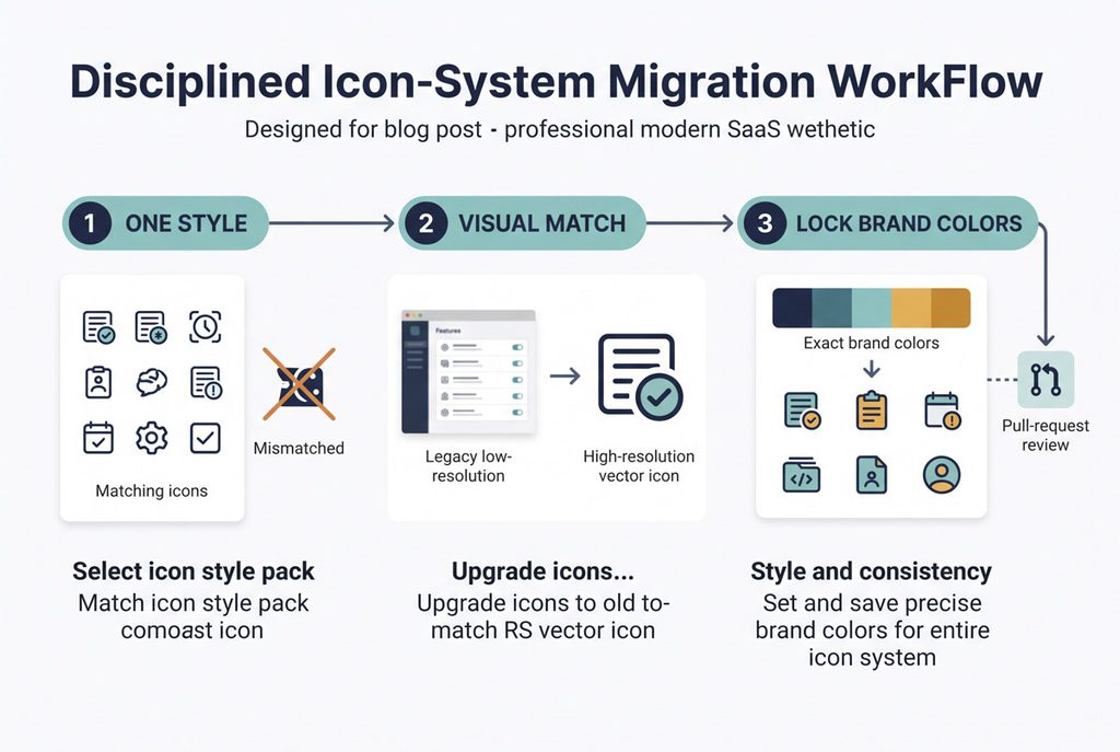
Never mix visual styles. Pick one strict pack like Windows 11 Outline or 3D Fluency. Force the entire team to stick to it. Mixing 3D art with flat minimalist vectors creates chaos. You are paying to eliminate visual fragmentation, not create it. Review every pull request for style compliance.
Upload screenshots of legacy assets into the search bar. Old, low-resolution raster graphics embedded in your code are hard to replace manually. Machine learning analyzes the uploaded shape. It returns the closest geometric matches from the vector library. Guessing the right keyword isn’t necessary anymore. Visual matching speeds up refactoring immensely.
Save specific brand colors directly inside the in-browser editor. Teams scale quickly. Junior developers start generating new variations with text overlays or strokes. Having exact HEX and RGB values pre-saved prevents UI degradation. Nobody wants an interface featuring five slightly different shades of blue. Standardizing the toolset keeps your interface clean.
